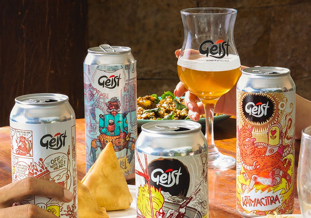
Last month, Geist Brewing Co., one of the Beer Capital’s first and most cherished craft beer brands, launched their super swanky crowlers in a brand new avatar. A design change that never looked so good. All four of their crowler variants got a makeover where labels have been designed from the ground up.
Just like the craft beer business, labeling art and design have experienced massive changes in India over the past several years. It has also inspired brewers and marketers to put more thought (and money) into the look and feel of their beers’ packaging, rather than just the beer itself. In fact, design has more effect on the end product than most drinkers realize. At their best, craft beer labels are thoughtful and thought-provoking, catchy and beautiful. They have the ability to story-tell a consumer by portraying imaginative translations of the beer that’s inside the bottle, can or a crowler in this case. Now that Geist has rolled out an eye-catching beer label, we had the desire to look behind the curtain at the people involved: creators, artists or designers and understand what goes into designing a beer label. Read further to find out how Geist pulled it off!
[caption id="attachment_27098" align="aligncenter" width="1000"] Geist’s first set of crowlers[/caption]
Geist collaborated with Illustrator Vinayak Varma right from their early days. Along with the branding, Vinayak had also worked on designing the first set of crowler labels. The designs have always been vibrant and catchy with a piece of story attached to them. For instance, if you look at Geist’s logo, there’s a red paint brush-like stroke that represents the handcrafted artistic work that goes behind every variant of their beer. Identical to that, every crowler label has been conceptualized and illustrated with a purpose in mind.
[caption id="attachment_27099" align="aligncenter" width="1000"] The all new ‘Uncle Dunkel’[/caption]
The Makeover
In early 2021, when Geist was planning to launch their first set of crowlers, they had a short window to get the designs out. They were created at short notice, and weren't quite as refined as the current ones. Typically, the entire design process would’ve taken a few months to conceptualize but pandemic didn’t leave the brand enough room to think over many design elements that would’ve added more aesthetics to the product. On the bright side, Vinayak had all the time in the world for newer sets of crowlers. He had more time to sketch templates, visualize distinct characters, select color palettes and styles for each of the labels, while keeping the Geist logo front and center.
[caption id="attachment_27100" align="aligncenter" width="1000"]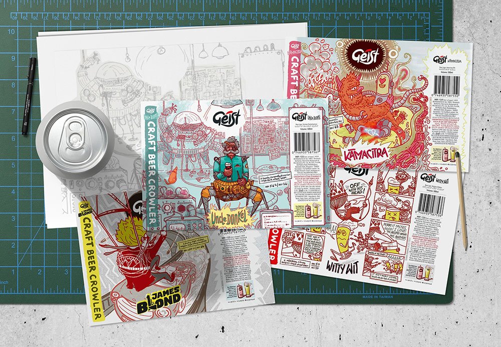 Brand new label designs. Image courtesy of Geist[/caption]
Beer labels are a canvas for a brand to portray their story. A story that describes the distinctiveness of a product or has an anchor to depict imaginative translations. With a new design, Geist has brought in a central character for every variant to imply a unique personality by striking a good balance between artistic experimentation and consistency across labels. Going the extra mile has always been the hallmark of distinction at Geist and this time, the brand deserves an applause for a crowler overhaul.
[caption id="attachment_27101" align="aligncenter" width="1000"] The all new ‘Kamacitra’[/caption]
Have you tried their crowlers yet? Head over to @drinkgeist to know more about their retail stores.