TOIT - INTERIOR DESIGN
Balan and Nambisan Architects
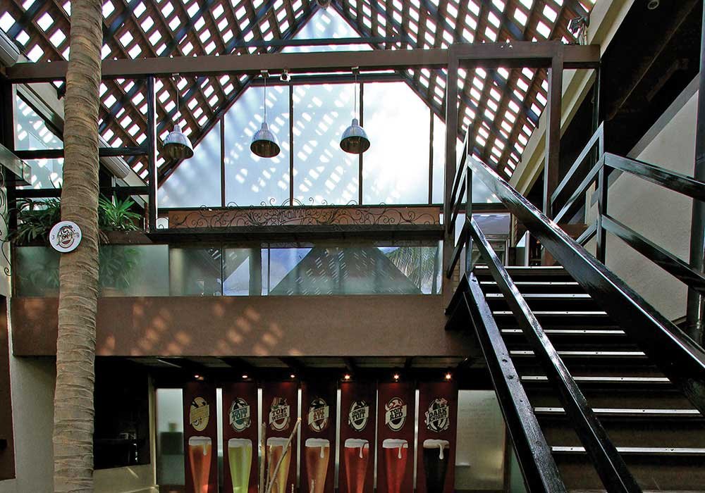
ToiT is one of Bangalore’s oldest and most popular brewery pubs. With a unique multi level design, it has become an inspiration for many beer enthusiasts in the city.
The brewery pub was designed by Balan and Nambisan Architects (BNA), in Bangalore.
The firm is headed by two principal architects Arun Balan and Arjun Nambisan, supported by a team of 25 master planners, architects and interior designers. BNA’s unique strength lies in its understanding of the client’s objectives, personality and values. The design philosophy behind ToiT is a clear outcome of this strength. Arun Balan speaks about the project, his inspiration and the product.
DESIGN THOUGHT AND INSPIRATION
ToiT is all about people and the vibes they share are central to the design philosophy. It’s a hot spot to gather, to unwind without trying too hard to fit in, or to have a great evening with friends, colleagues or just by yourself.
Our first thought was to capitalise on the volume that the premise had to offer. The challenge was to identify the structural elements so that we could eliminate the walls in between, therefore opening the place up. Once this was done the various levels looked into each other across the central courtyard three floors high. The visual as a resultant is stunning and engaging. You will always see people peering over the edge to get a glimpse of what’s going on at the other levels-it could be the brew tanks at the first level or the elevated stage at the next.
The multi-levels have been designed keeping various user groups in mind. Toit entertains all kinds of guests-from fine dining to a nice sunny morning space to a dance floor to just basic areas to hang at the lower level. There is something for everyone. The design offers a solution to what most people in the hospitality sector seek to resolve. Keeping the costs to manageable limits, the challenge was to scoop out spaces that exude warmth, friendly and inviting spaces that will be as vibrant as the users themselves.
[gallery size="full" columns="2" ids="5596,5597"]
MATERIAL PALETTE
The idea here was to make sure the whole ambience doesn’t get too overbearing and pretentious.
Being true to the brief we were given, we wanted to use material that one could identify with. Brick as an element that is used across gives the user a sense of being part of the old world British pub. It is warm and friendly and has a sort of the old world charm. There is ample use of basic metal details and wood. Flooring essentially is wood and tiles, so while wood evokes warmth, tiles are hardy and durable. The use of wood seamlessly across floors stitches the spaces as a whole in more ways than one.
The profile of the pub was to be ‘the place across the street where one could hang with friends and listen to some great music and gorge on yummy food on the way home from work’. Hence the palette of material
we wanted to use had to auger well for this cause.
INTEGRATION OF THE LEVELS
I think as designers, that was the biggest challenge for us. The nature of the building structure being composite, it was that much more of a challenge to structurally reconcile all levels and make it function as one whole. Edges of all levels were looked into carefully to allow for the connect. This turned out to be the focal point of the design direction. The uniqueness that approach brought about is one of biggest features of the interiors.
THE BUDGET
As with all programs, cost and its implications posed a unique problem.
The tight budget meant that one had to consistently focus on the customer experience of touch-feel. Detailing and use of material that normally defines budgets had to be closely looked at. Ostentatious display had to avoided, and so everything you see in the pub is there for a reason-either to light up the space, provide security, comfortable seating or a visual experience etc.
Their interior architecture therefore had to be resolved in a manner that made sure the basic design-function don’t conflict but complement each other.
LANGUAGE
The language was retro and therefore the visuals had to keep the theme. The vintage nature of the visuals has do with the iconic status of the subject, be it movies, musicians or the artists depicted. This, we felt, would provide a reverent notion that most of the target group relates to.
Roofing is done with the typical Mangalore tiles with glass insets. The play of light and shade gives a very distinct flavour during the day and the glow, almost a halo like feel from the outside in the evenings.
[gallery size="full" columns="2" ids="5598,5599"]
OF FURNITURE AND FURNISHINGS
The furniture used addresses the requirements of the varied seating typology of the space. We have the old fashioned benches which most youngsters relate to either from school or maybe even an old fashioned workshop. The high bar stools has a very British feel, in keeping with the language of the place. The lack of forced detailing across all furniture types keeps the place looking raw and purely functional. The bed type seating at the sun lounge at the top floor caters to the lot who come seeking a place to ‘park’ maybe on a Sunday morning with family and friends, and soak in the warmth of the sun streaming through the tiles.
The largely retro use of wood predominantly exudes a sense of warmth and friendliness.
Recycling and refurbishing old furniture was done to keep costs low and also to infuse life into lovely old furniture which otherwise would have made its way to the streets.
LIGHTING
Lighting has a lot of emphasis, as should be in a place like this. The thrust here is on the lighting effect rather than the light fitting. Most of the lamps you see here are low cost, most unpretentious and almost invisible. The lighting level achieved is subdued and completely functional, keeping with the nature of the design and function. It isn’t dark and dingy-giving it a club like feel and nor is it too bright and loud like a wannabe restaurant. The thrust is to emphasise the movement path, light up art, graphics and the posters and more importantly the brew tanks, and just meets the level of lighting required across the different table tops at all the levels.
OF FURNITURE AND FURNISHINGS
The furniture used addresses the requirements of the varied seating typology of the space. We have the old fashioned benches which most youngsters relate to either from school or maybe even an old fashioned workshop. The high bar stools has a very British feel, in keeping with the language of the place. The lack of forced detailing across all furniture types keeps the place looking raw and purely functional. The bed type seating at the sun lounge at the top floor caters to the lot who come seeking a place to ‘park’ maybe on a Sunday morning with family and friends, and soak in the warmth of the sun streaming through the tiles.
The largely retro use of wood predominantly exudes a sense of warmth and friendliness.
Recycling and refurbishing old furniture was done to keep costs low and also to infuse life into lovely old furniture which otherwise would have made its way to the streets.

LIGHTING
Lighting has a lot of emphasis, as should be in a place like this. The thrust here is on the lighting effect rather than the light fitting. Most of the lamps you see here are low cost, most unpretentious and almost invisible. The lighting level achieved is subdued and completely functional, keeping with the nature of the design and function. It isn’t dark and dingy-giving it a club like feel and nor is it too bright and loud like a wannabe restaurant. The thrust is to emphasise the movement path, light up art, graphics and the posters and more importantly the brew tanks, and just meets the level of lighting required across the different table tops at all the levels.